Integrative Medicine Case Reports, Volume 5, Issue 1 (January), 2024
Evidence-based colors of universe as a alternative therapy in naturopathy
KEY WORDS
Color Therapy
Cognition
We live in a universe of Color (1). As the different explorations indicate, the Color that encompasses us in our day-to-day routines profoundly affects our temperament and nature (2–4).In clothing, insides, scenes, and, surprisingly, regular light, Color can change our character from upsetting to pleased, from confusion to information, from dread to conviction. It can be utilized to “level out” feelings or to make various mindsets (1). Colors influence emotions, Color has two properties, physical and physiological, which affect a human being differently as absorbed by the eyes (Visual pathway/optic pathway). Now a days, color therapy has been used in various sectors. Color is one of the crucial elements in designing the appropriate circulation of public interiors.
Furthermore, the function, surrounding environment, and the user profile are essential factors that interactively affect people’s emotional situations. Therefore, colors must be studied in real contexts because they are experienced in environments where complex patterns interact with perceptions and behavior (1). Color psychology, color breathing, color meditation, color diagnosis, etc., are modifications of color therapy that are scientifically based and accepted worldwide.
Color has physical and psychological properties, and Color has been found to build an individual’s excitement or arousal (5). They have an underground result on how individuals feel both mentally and physically. Different colors address different states of mind. Color is one of the compelling elements in a space that impacts how people express their feelings. Colors have numerous passionate impacts, mainly through heating, cooling, stimulating, balancing, exciting, and soothing properties. Color is fundamental to sight, identification, interpretation, perceptions, and senses. Some colors evoke psychological reactions through signals such as warmth, relaxation, danger, energy, purity, and death (6). It is important to reiterate that, for a color study to be successful, confounding variables such as subjects’ age, gender, emotion, hue, brightness, saturation, light sources, adjacent colors, contexts, and cultural factors must be precisely controlled. Color is the visual perceptual property relating people to the classifications called red, green, blue, and others. Color comes from the range of light (circulation of light energy versus frequency) collaborating in the eye with the phantom awarenesses of the light receptors. The seven shades of the range are created by light influxes of fluctuated lengths that bounce off substantial quicken and lifeless things (1). Light and Color are just an issue of vibrational recurrence. Each Color has its unique frequency through which it will penetrate the aura and gets a change in physical and psychological level. Color also has three dimensions, i.e., length, breadth, and height.
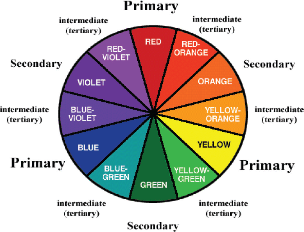
Chromatics or color therapy is the study of Color, which investigates this relationship (7). The human eye is capable of seeing over 7 million colors. These colors are obtained from the basic blocks of the primary, secondary, and tertiary colors.
Figure 1: The classification of colors.
The classification of colors (Figure 1) includes Primary, secondary, tertiary, Warm, Cool, Neutral, Complimentary, Analogous, Tint, and shades; primary colors: The Primary/essential tones are the three fundamental shades: red, blue, and yellow. These colors can’t be made by blending others; they are the basis of all the other shades of colors they generate. Assuming the essential tones are blended in equivalent sums, the coming about shading is permanently dark. Secondary colors: These are the ones that are accomplished by combining equal measures of two primaries. There are three secondary/auxiliary tones: Green (a combination of red and yellow), orange (a combination of blue and yellow), and violet (a blend of red and blue).
The tertiary colors: Tertiary tones are accomplished by blending equivalent measures of essential (Primary) and auxiliary (Secondary) tones. There are six tertiary tones, which are lime as a combination of Green with yellow, purple as a combination of violet with red, saffron as acombination of orange and red, lavender as a combination of violet with blue, golden as a combination of yellow with orange, and turquoise as a combination of green with blue. While mixing dark or white to these tones, tints and shades will be the outcomes, while tones portray the profundity of shading.
Warm colors are shades and tints of all red colors. Cool colors are shades and tints of all blue colors; Green is considered a Neutral color because it has a balancing wavelength among seven fundamental colors. Complimentary colors sit opposite each other on the color wheel. Analogous colors sit next to each other on the color wheel. They tend to look pleasant together because they are closely related.
Colors physically affect humans due to its energy and apparently oversees the body temperature, hunger, sexual capacities, sleeping & behavioral patterns.
References
1. Kurt S, Osueke KK. The effects of ColorColor on the moods of college students. Sage Open. 2014 Feb 27;4(1):2158244014525423.
2. Kwallek N, Woodson H, Lewis CM, Sales C. Impact of three interior color schemes on worker mood and performance relative to individual environmental sensitivity. Color Research & Application: Endorsed by Inter‐Society Color Council, The Colour Group (Great Britain), Canadian Society for Color, Color Science Association of Japan, Dutch Society for the Study of Color, The Swedish Colour Centre Foundation, Colour Society of Australia, Centre Français de la Couleur. 1997 Apr;22(2):121–32.
3. Kwallek N, Lewis CM, Robbins AS. Effects of office interior ColorColor on workers’ mood and productivity. Perceptual and motor skills. 1988 Feb;66(1):123–8.
4. Babin BJ, Hardesty DM, Suter TA. Color and shopping intentions: The intervening effect of price fairness and perceived effect. Journal of business research. 2003 Jul 1;56(7):541–51.
5. Huchendorf L. The effects of ColorColor on memory. WL Journal of Undergraduate Research X. 2007:1–4.
6. Young MF. Chiropractic Management of Heartburn, Dyspepsia and Reflux in Chronically Symptomatic Adults. University of South Wales (United Kingdom); 2010.
7. Graham JR. MMPI-2: Assessing personality and psychopathology. Oxford University Press; 1990.
doi: 10.38205/imcr.050101